When my clients purchased this oceanfront home, it’s bones were good and the view was breathtaking. The interiors, however, felt cold and flat.
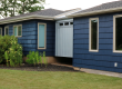
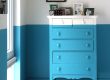
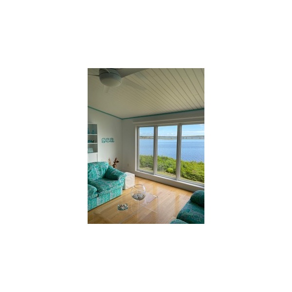
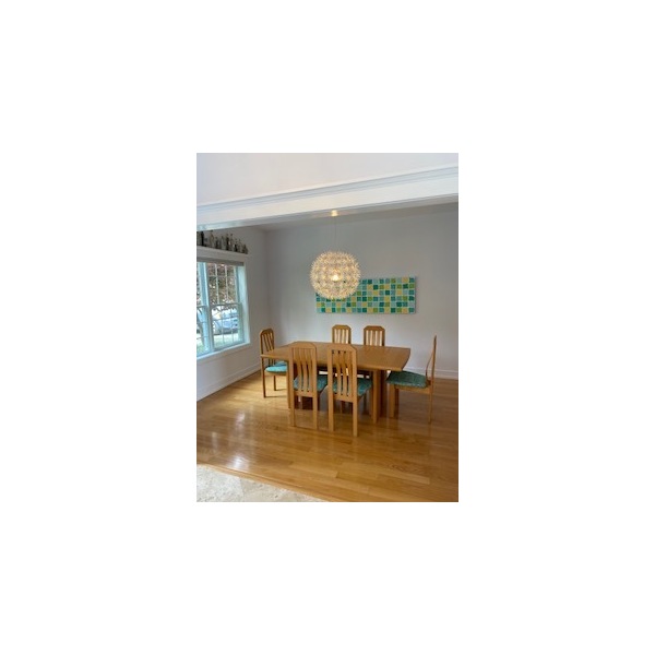
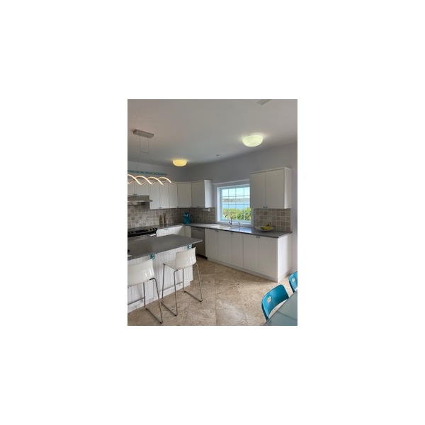
Harsh lighting flattened every surface, clinical white walls amplified glare, and turquoise accents leaned heavily into a literal beach theme. My clients wanted something far more calming and welcoming.
Their brief was clear: warmth, whimsy, and refinement — without coastal cliché.
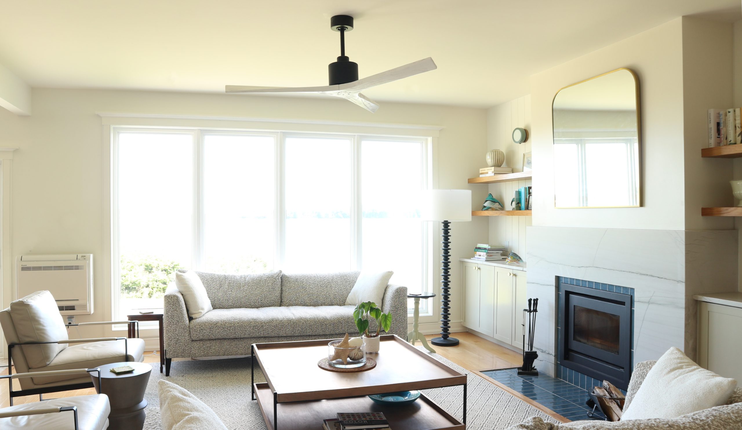
Moving From Literal to Layered
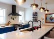
Rather than abandon the coastal influence, we reinterpreted it. All furnishings, finishes, fixtures, and fireplace were carefully chosen to completely transform this home. Here are a few before photos:
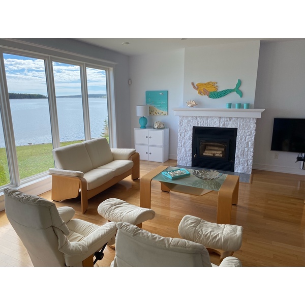

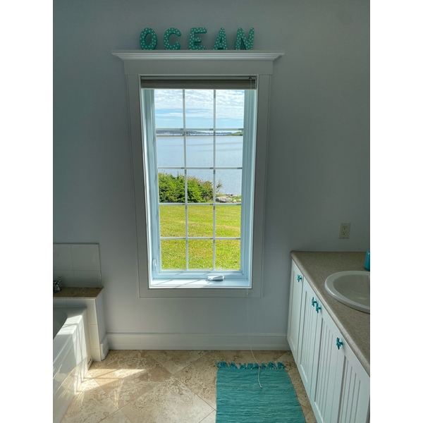
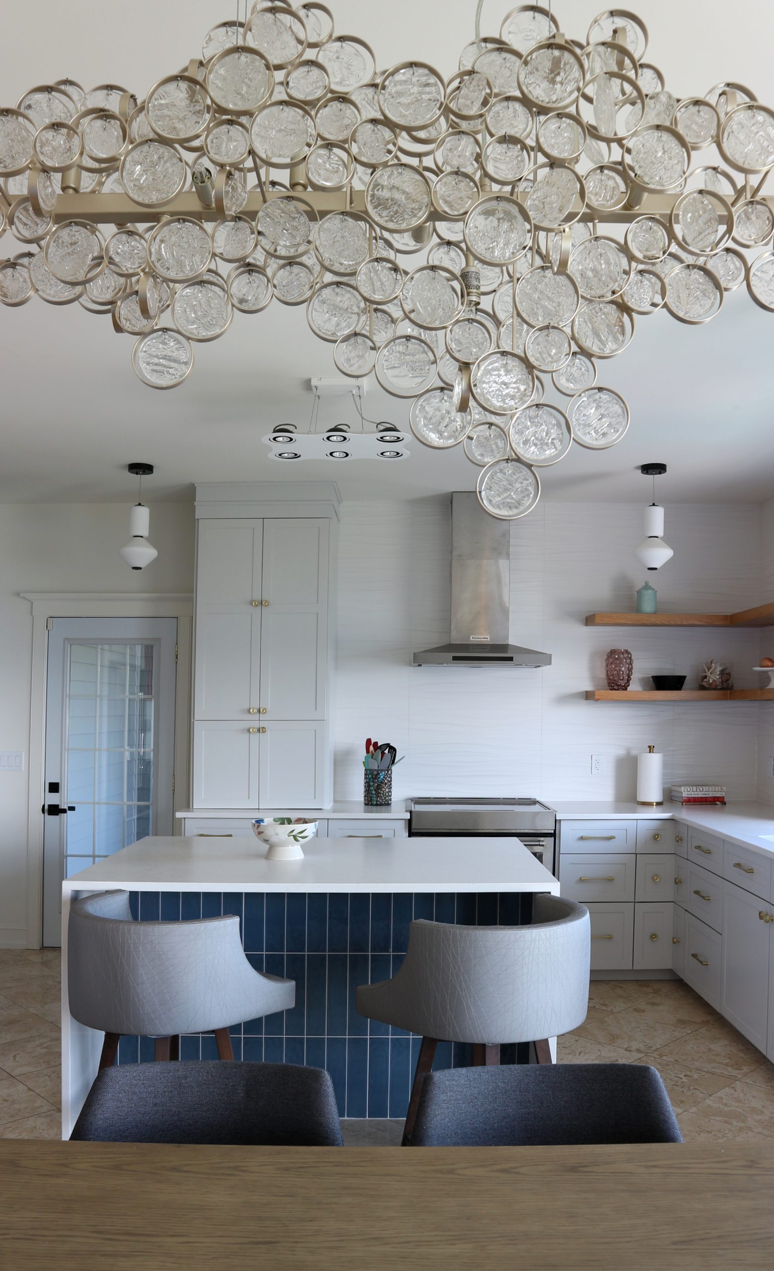
Blues were deepened and used architecturally rather than decoratively. Brass replaced chrome, bringing sunlit warmth and refinement. New millwork and carefully chosen materials added substance and cohesion throughout the home.
The ocean remains part of the story, but now as atmosphere rather than theme.


A Whole-Home Tonal Transformation
The most significant shift in the home was tonal.
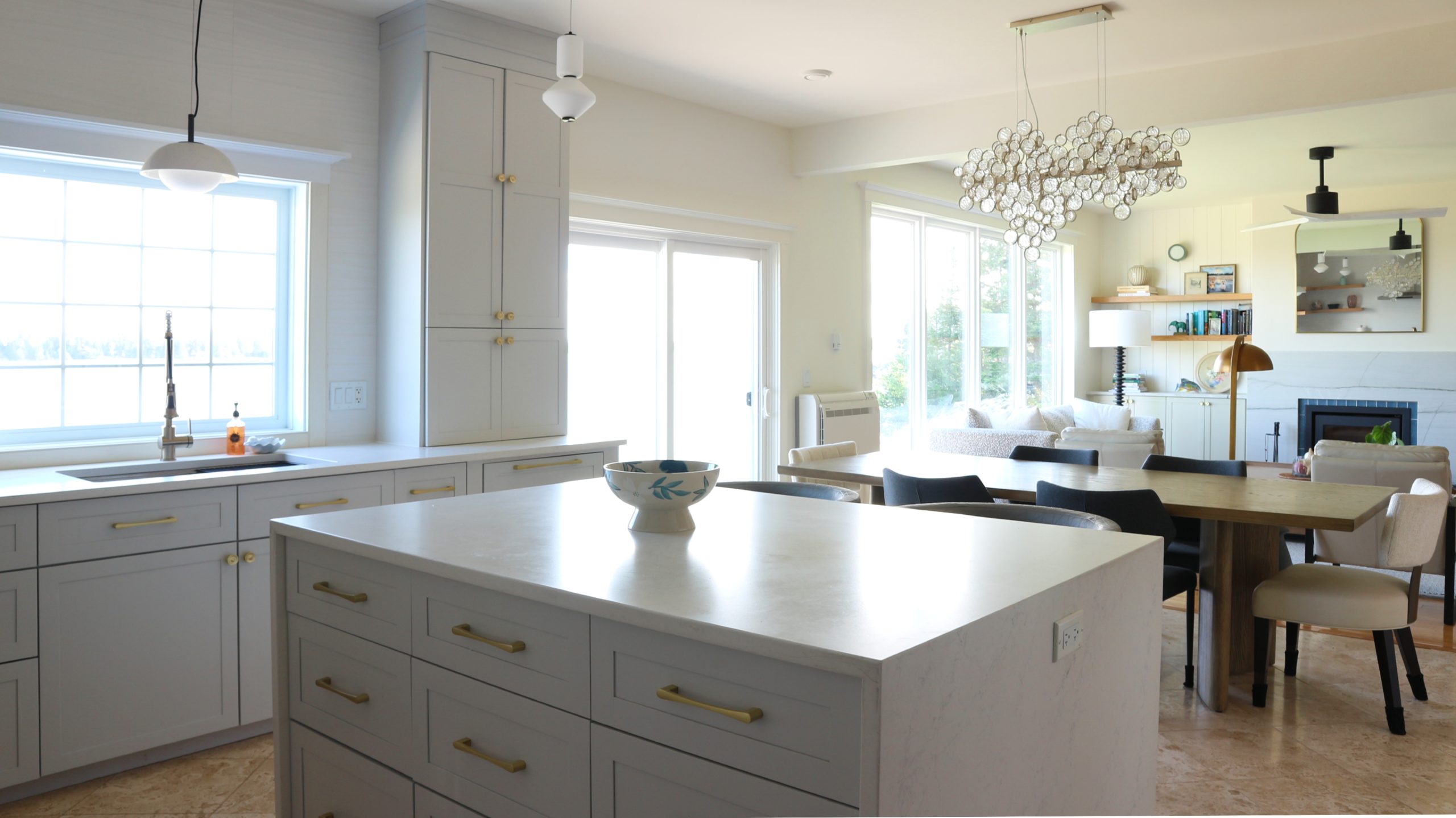
Layered lighting in playful forms replaced the glary fixtures, instantly softening the interiors. Paint colours were carefully positioned to bring warmth that flatters both people and materials, while subtle gloss sheens gently reflect light throughout the home.
The transformation was dramatic. Hardwood and tile floors the homeowners once disliked now glow in soft sandy tones — prompting my client to marvel that they could possibly be the same floors.
When colour, lighting, and sheen are working in harmony, materials can reveal entirely new character.
Designing for Ocean Setting Without Cliché
Homes with extraordinary views require balance. Interiors must feel intentional while allowing the landscape to remain the focal point.
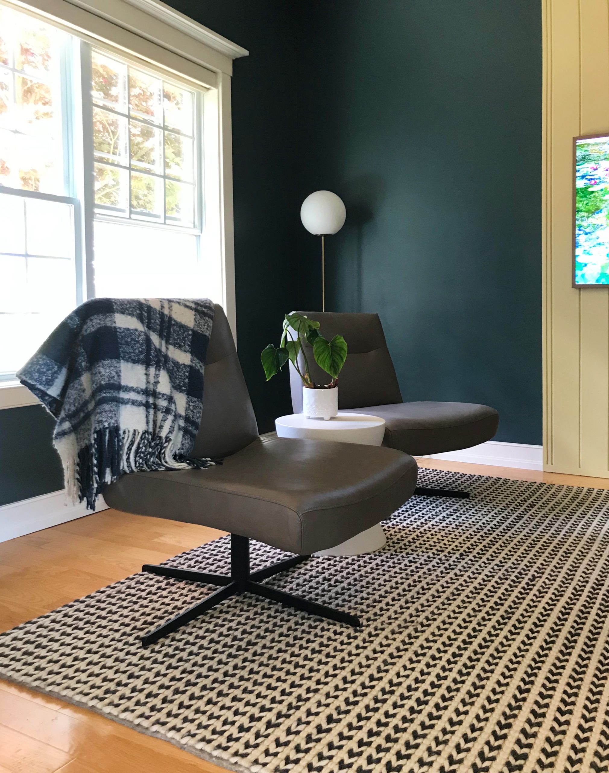
Rich blues, warm brass, natural textures, and tailored millwork create depth and warmth while letting the ocean light take centre stage.
A Bold Moment of Whimsy
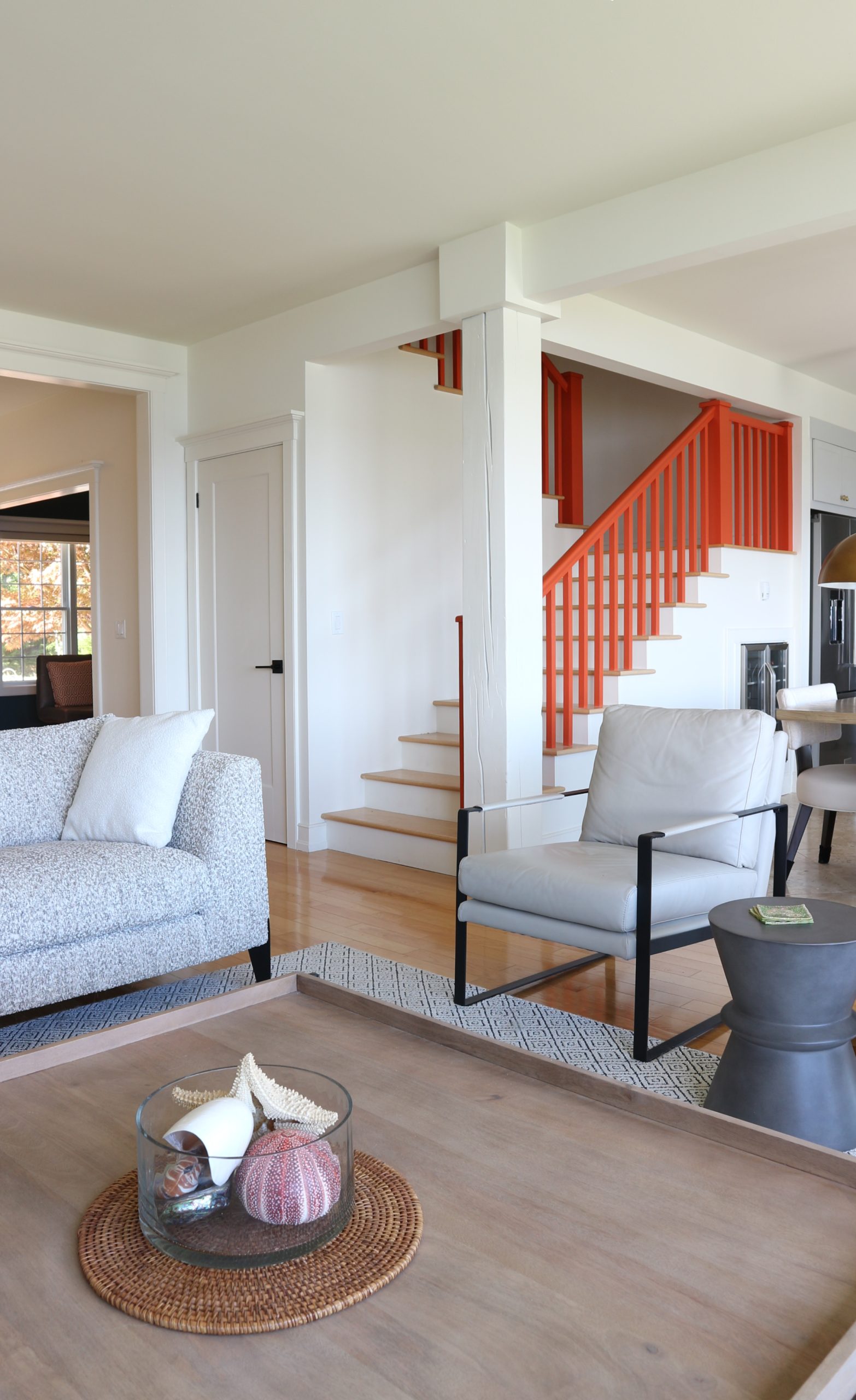
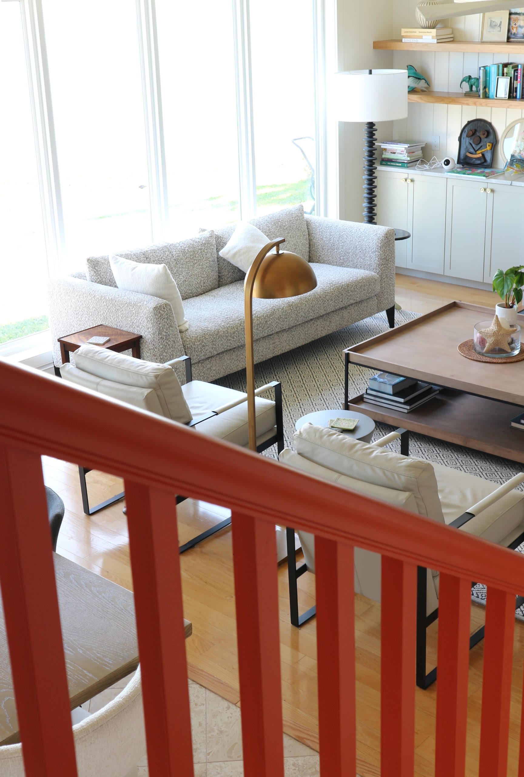
My clients initially felt the lacklustre stair railings would need to be replaced.
Instead, we made a bold move – painting them Farrow & Ball Charlotte’s Locks, a confident orange that instantly adds a joyful note of personality.
A Home That Reflects Its Owners
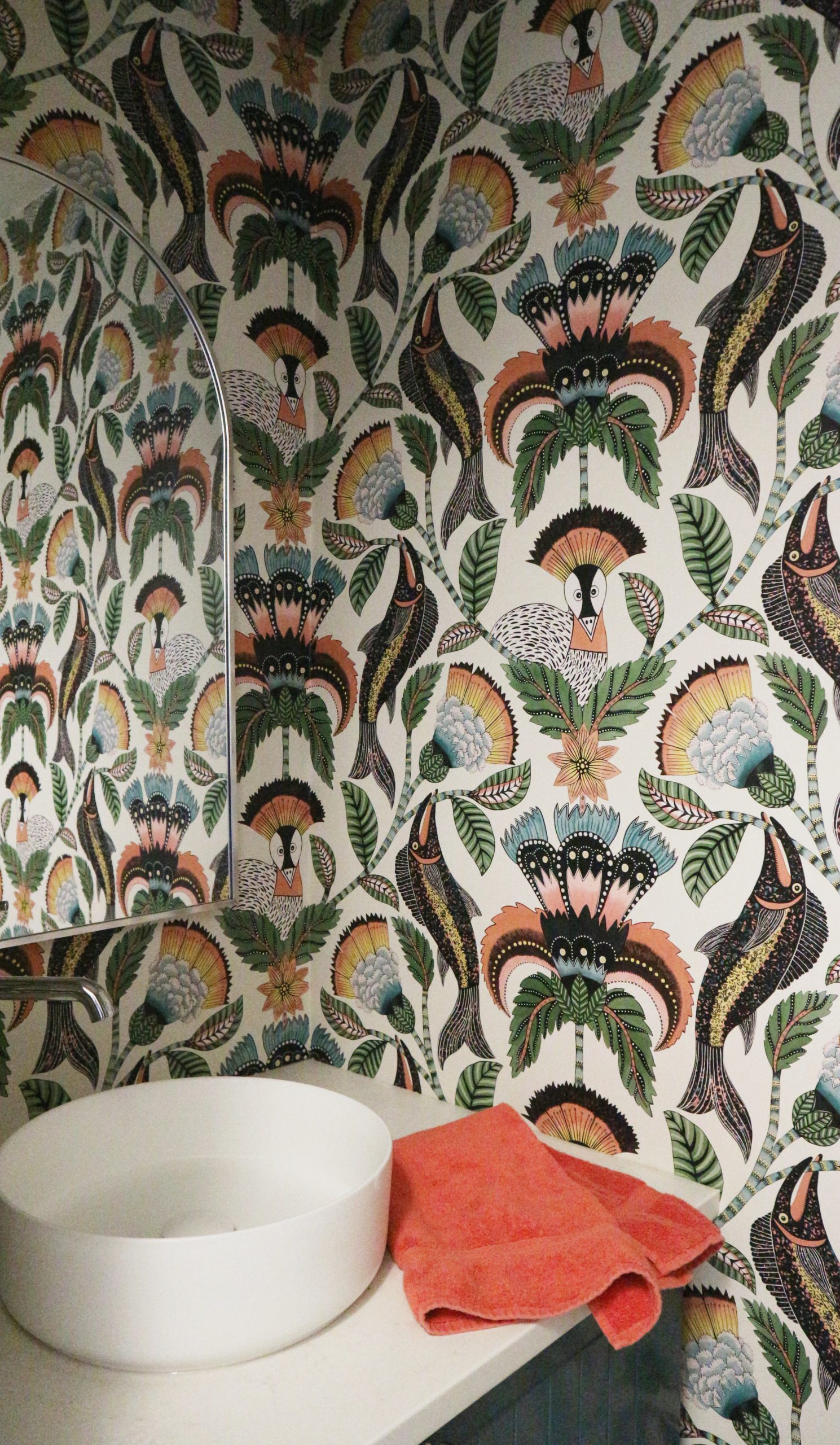
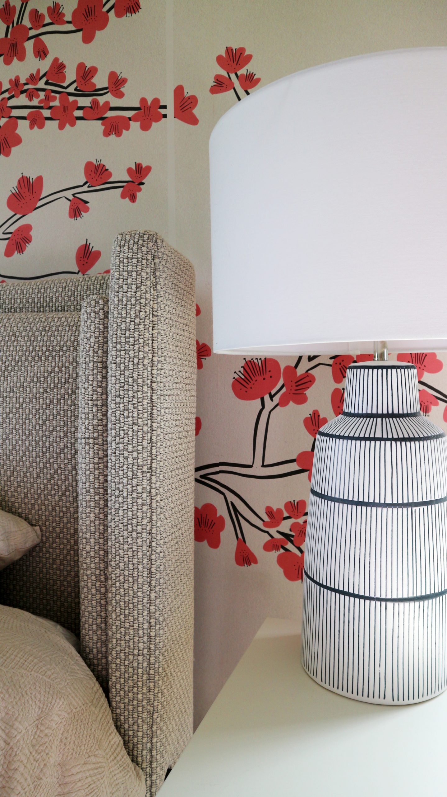
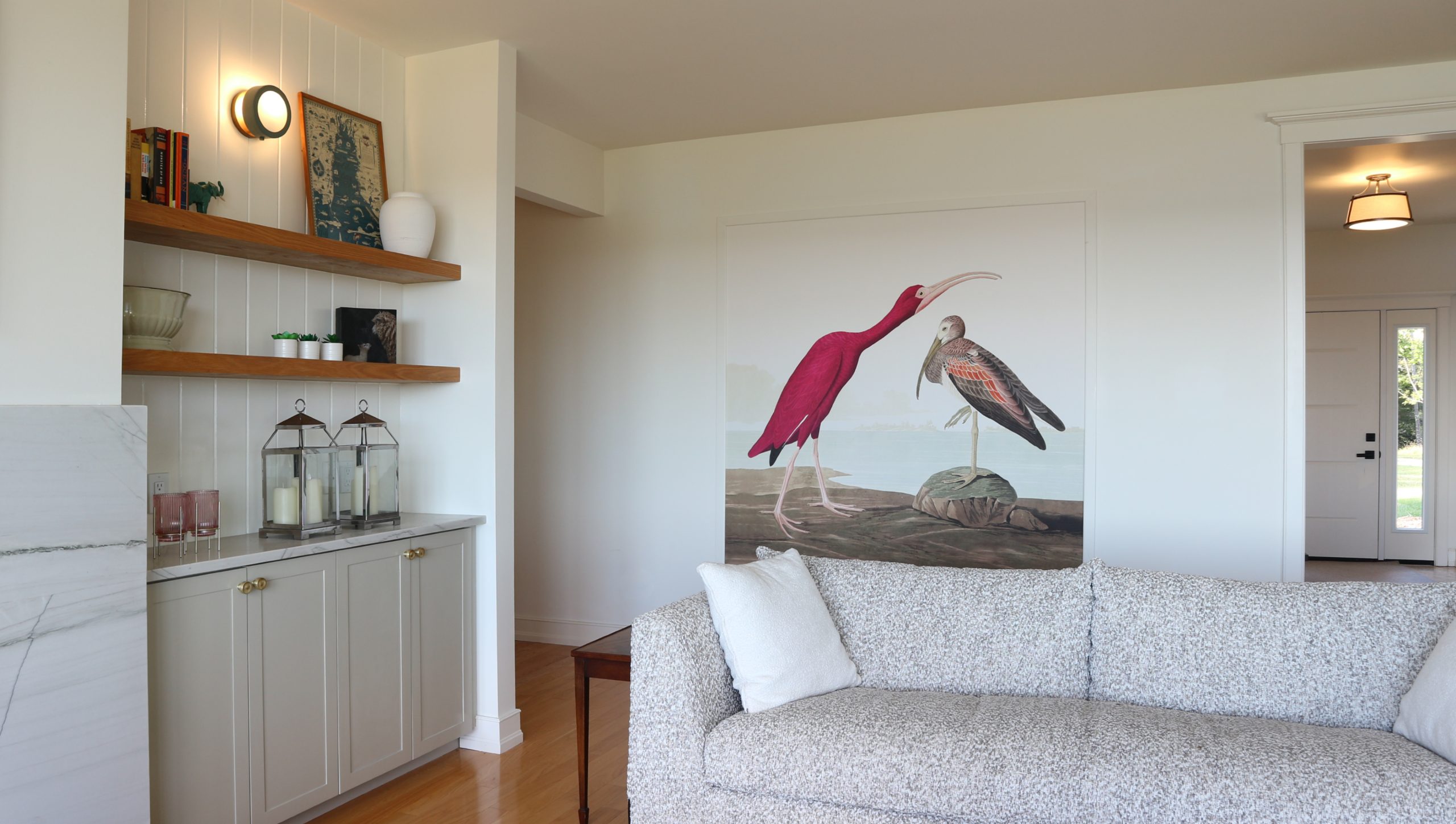
Among the most personal touches are the wallpaper selections that make a statement about our clients’ love of bird watching. The large ibis panel in the great room and the exuberant bird treatment in the powder room are a nod to the homeowner’s love of birds. The motif appears again in the bedroom, this time in a softer, gentler setting of cherry blossoms.
Today the home feels warm, layered, and confidently expressive. The ocean remains the backdrop, while the interiors now carry their own identity – thoughtful, sophisticated, and deeply reflective of the people who live there.
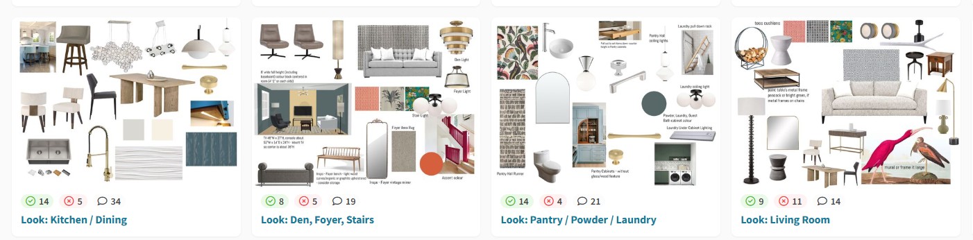
Design Boards