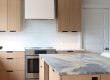
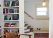
This Windsor home sits comfortably in its mid-century skin — low-slung, horizontal, and thoughtfully scaled. The challenge wasn’t how to make it bigger. It was how to make it feel as though it had always been this way.
The homeowners’ goals were clear and practical:
a new garage addition, a new and larger ensuite, an efficient, organized walk-in closet, and a welcoming mudroom designed for everyday living — coats, boots, bags, and regular comings and goings. Just as important was preserving daylight and the calm rhythm of the existing home.
This project is one of several Nova Scotia residential interior design projects focused on thoughtful additions that respect both architecture and everyday living.
Designing the Addition to Belong
From the outset, the brief was architectural restraint. The new structures echo the original house in every meaningful way — matching siding materials, window proportions, doors, rooflines, and structural form. Inside, existing cabinetry, lighting, and finishes were carefully honoured, allowing the home to feel cohesive while gently elevating the light and updating the spaces in a way that feels natural rather than jarring. Nothing competes; everything converses.
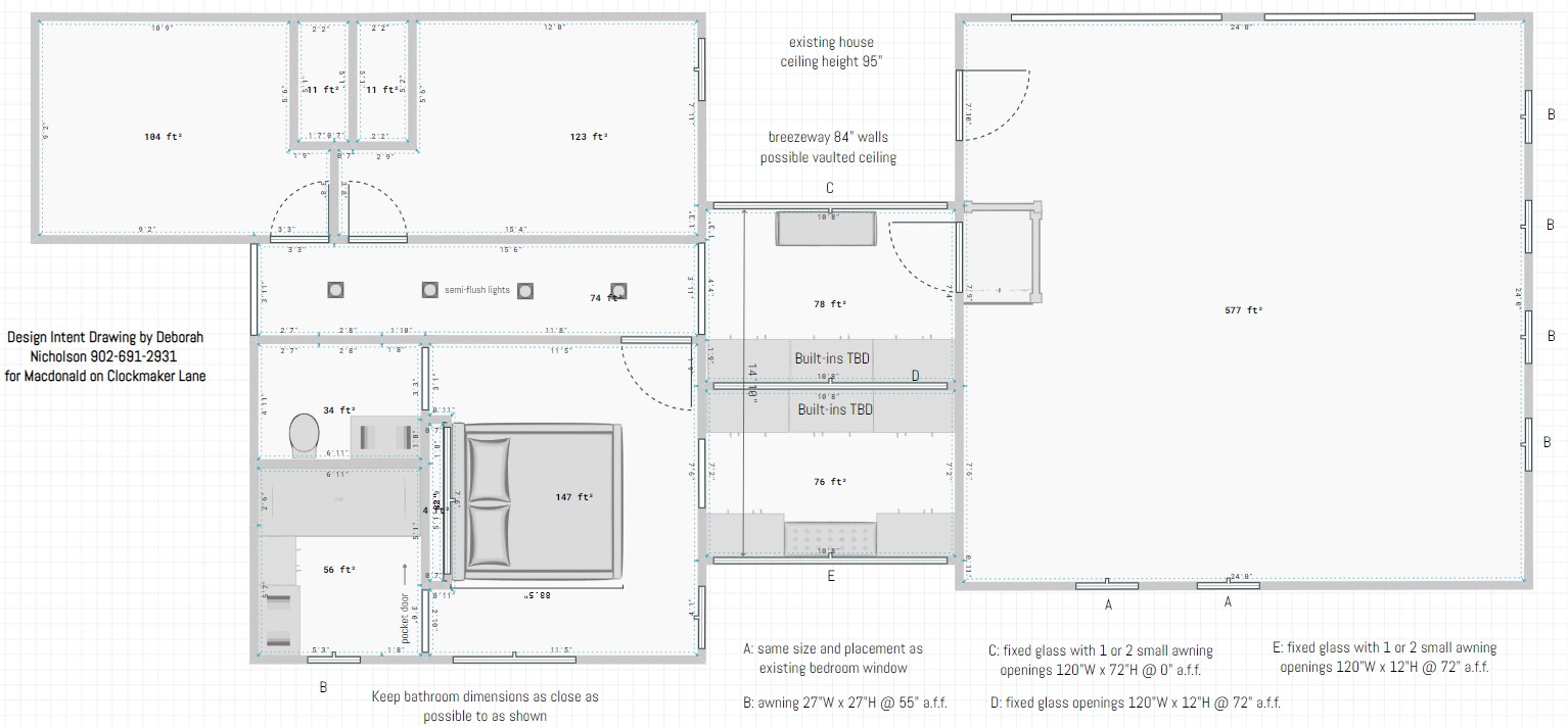
Rather than attaching the addition directly to the existing house, the two volumes are connected by a light-filled breezeway — conceived as a bridge rather than a hallway. This approach allows daylight to continue reaching the original rooms on that side of the home, avoiding the shadowy conditions that can result from poorly considered additions.
A Breezeway That Works Hard
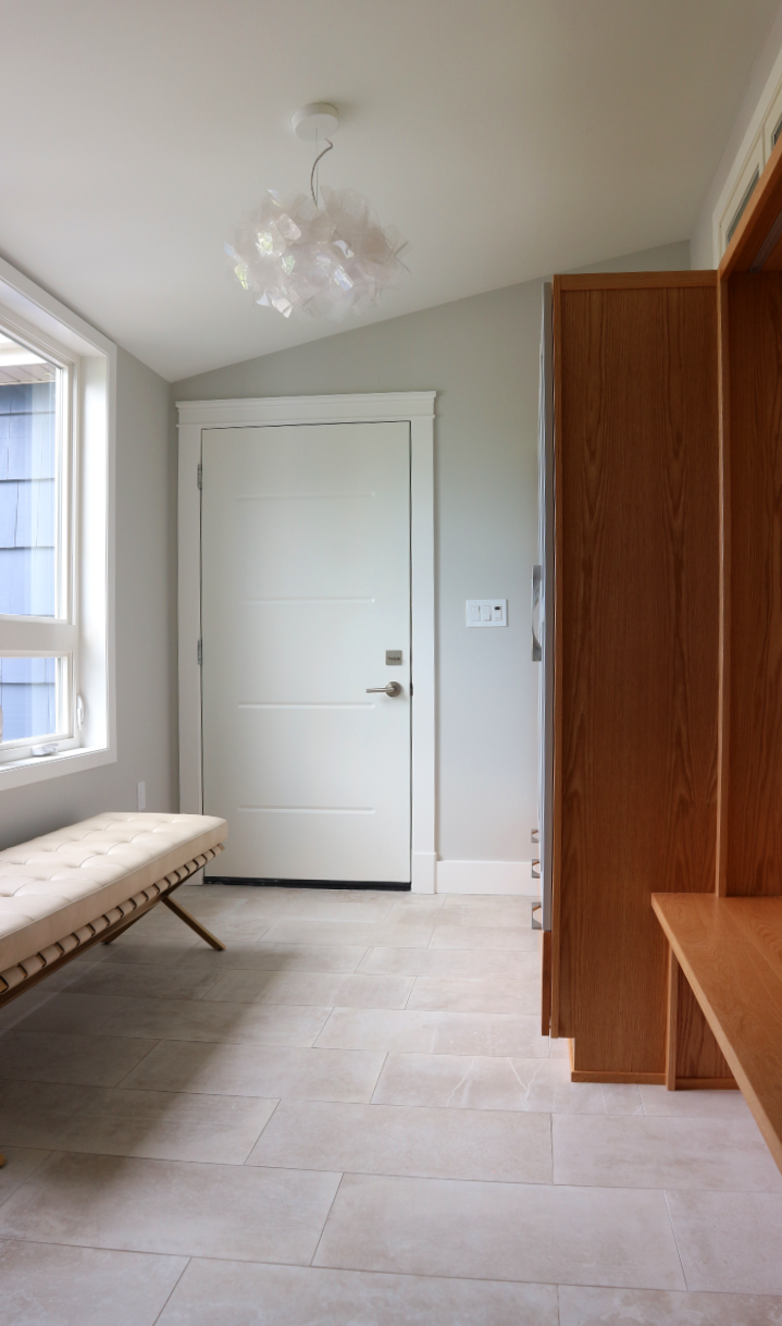
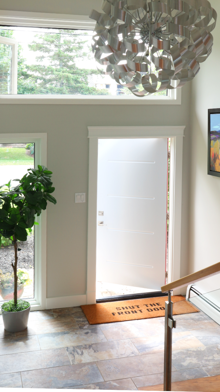
This connecting space houses both the mudroom and the walk-in closet — two highly functional areas that rarely receive architectural attention. To preserve precious storage space while maintaining a sense of openness, transom windows run along the top of the breezeway, capturing both east and west light as it moves through the day.
In the mudroom, a large window expands the room to take in the lake view, turning a utilitarian space into one that feels generous and connected to its surroundings. It’s a small moment with an outsized impact — proof that functional spaces deserve beauty, too.
Inside the Primary Suite — Designed for Comfort and Accessibility
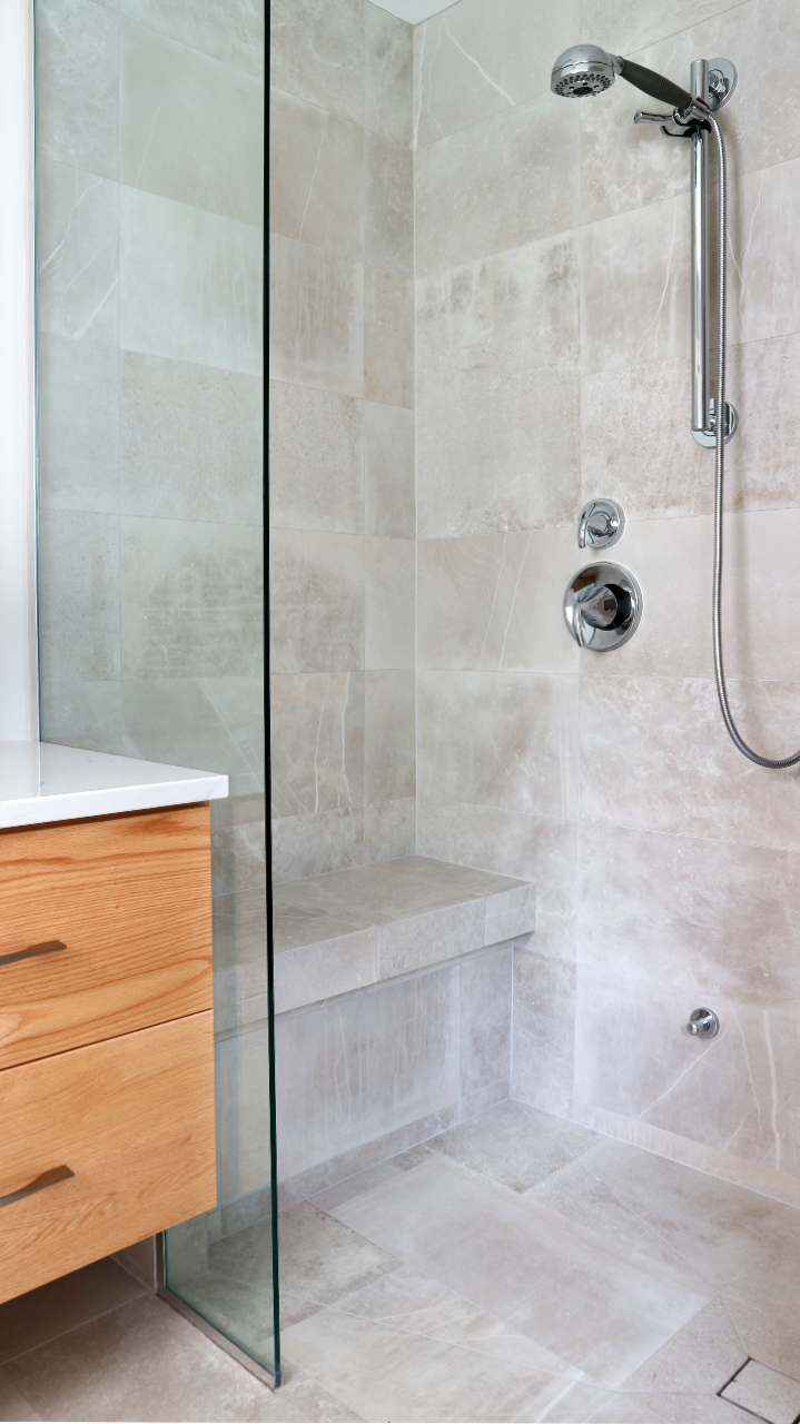
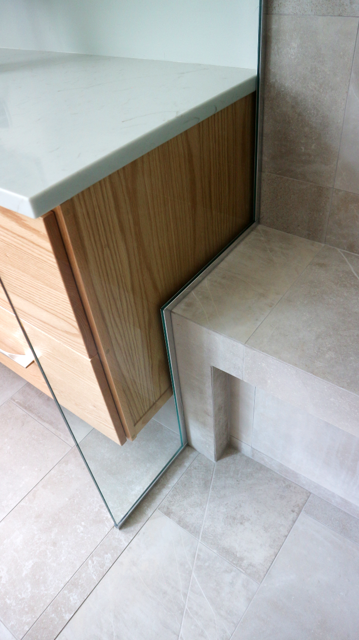
The reconfigured primary bedroom suite balances comfort with clarity. The feel is calm and grounded, with warm wood cabinetry, soft grey tones, and a simple, well-considered layout that supports daily routines without visual noise. The shower room and water closet were thoughtfully planned with universal access in mind, ensuring ease of movement and long-term usability without compromising the home’s clean, modern feel. Clean lines, thoughtful storage, and an emphasis on light create a space that feels both modern and timeless — in keeping with the home’s mid-century roots.
Throughout the interior, the design focuses on ease: clear circulation, durable materials, and a sense of quiet continuity from room to room.
A Collaborative Process
As the homeowner shared:
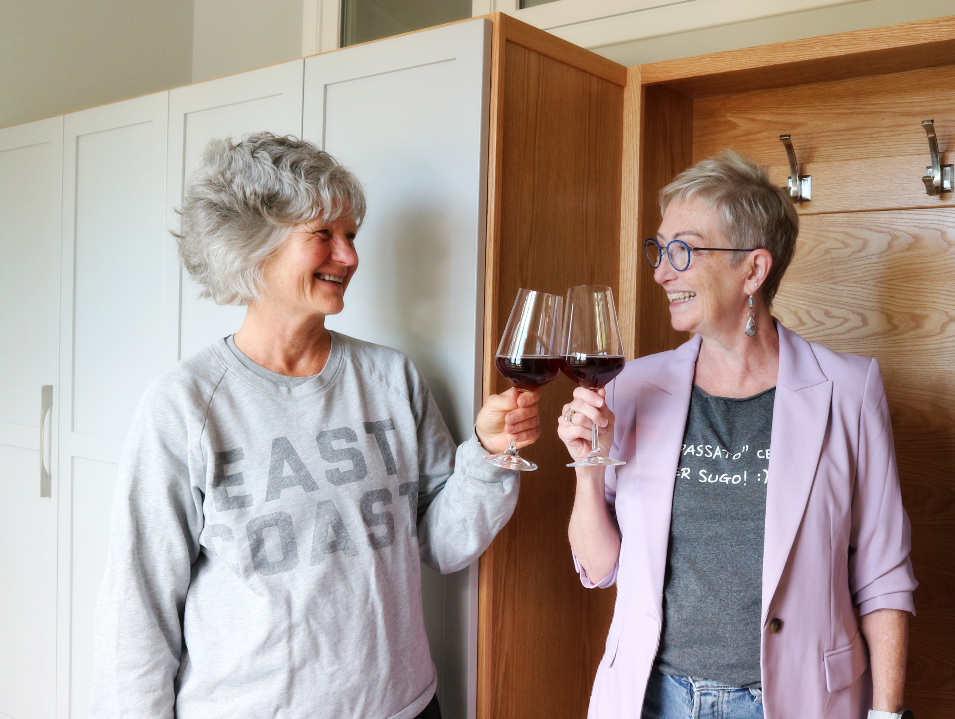
“I really enjoyed working with Deborah. I very quickly learned to trust her ideas and creativity. She is wonderful at incorporating clients’ ideas and needs with her impeccable sense of design.”
That trust made it possible to create an addition that feels seamless, purposeful, and deeply connected to how the homeowners live.
This project is a reminder that successful additions aren’t about standing out — they’re about fitting in beautifully.