

Nova Scotia Interior Design — Bold Colour, Pattern Play, and Joyful Décor
Last week, Jennifer Anandanayagam interviewed me for Saltwire on the subject of brightening our homes with colour and patterns. Read on for reasons why, along with some how-to tips that won’t empty your piggy bank…
Jennifer: Do you think there is a trend toward people wanting to ditch gray walls and furniture and move towards infusing bright colours in their homes? What is the reason for this shift?
Deborah: Oh, absolutely! There are a few reasons for this shift. When the world is a big and scary place, we get nostalgic for the past and that often includes our childhood. Bright colours play a huge role in most childhoods, bringing joy, energy, and a playfulness.
Also, as we continue moving into a post-consumer mindset, we tend to look at who’s doing it best, and that would be Europeans. Their homes evolve over time. They layer beloved pieces rather than replacing everything with the latest trend. This results in a colourful and multi patterned home that feels lively, warm, and deeply personal.
But, on an even more fundamental level, humans are naturally drawn to bright, saturated colours. Our ancestors relied on this instinct for survival—spotting ripe fruit and nourishing berries in nature. That same dopamine response is still in us today, making bold colours feel inherently joyful and energizing.
At the end of the day, we’re happiest when we surround ourselves with things we love. We all have colours that resonate and simply make us feel happy.
Jennifer: What are some of the bright hues that are in demand?
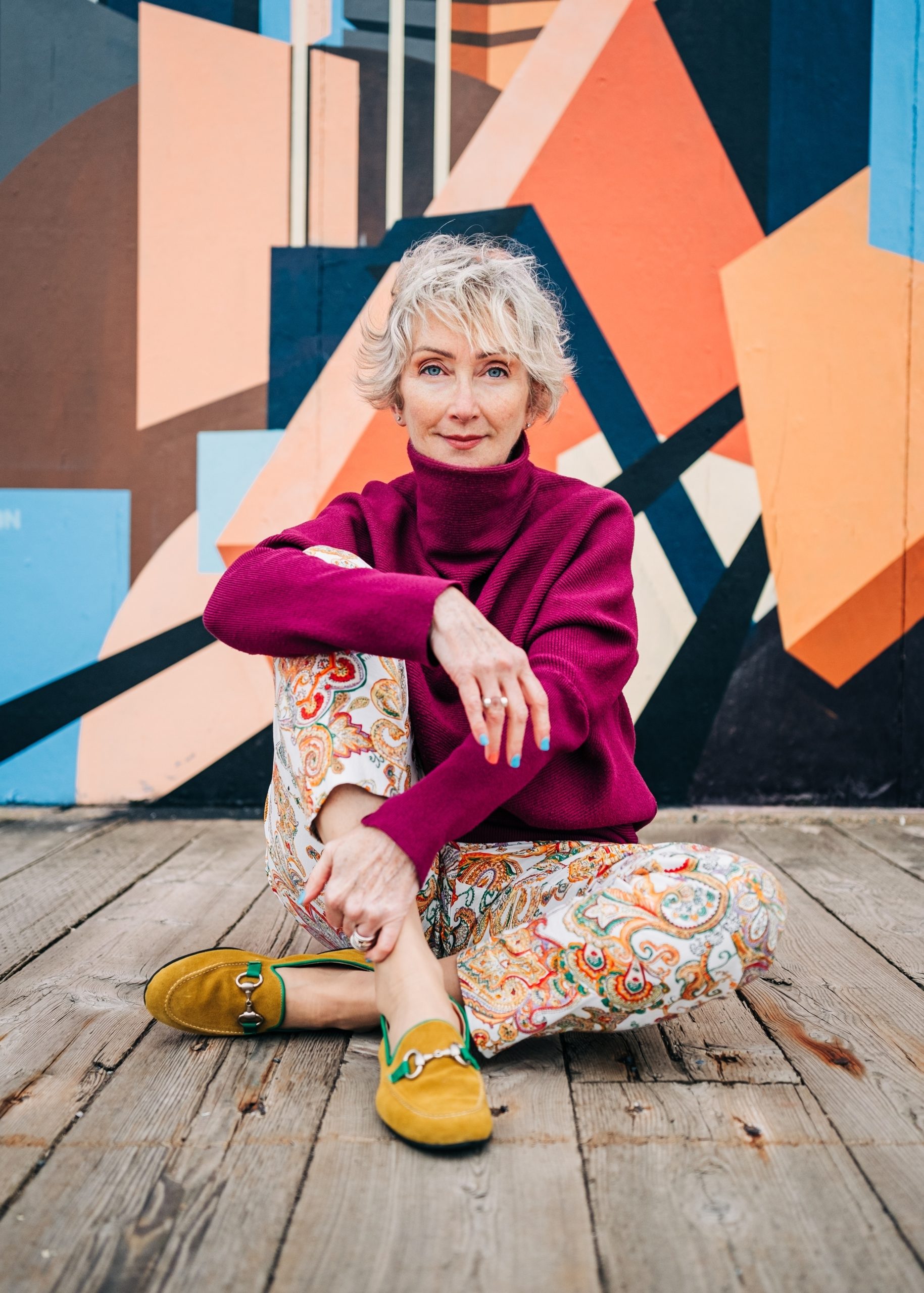
Deborah: Earthy tones are back (think of the 1970s) but it’s more about depth and richness this time. We’re seeing a lot of deep, moody hues— deep chocolates, and rich oxbloods—especially on walls, trim, ceilings, and large furniture pieces. These dramatic backdrops are perfect for vibrant hues to truly shine.
As for brighter hues, warm and energetic shades are taking the lead—think ochres, corals, and emeralds.
Jennifer: What about mixing and matching patterns? Is there an appeal for this, and why do you think this is?
Oh! Thinking of British pattern play? Mixing patterns is what makes a home feel joyful and nurturing. The Brits have mastered this—perhaps as a response to their famously grey climate—using colour and pattern to create warm, inviting interiors.
Patterns naturally draw the eye, offering visual interest and a sense of movement. A space without pattern can feel static and uninviting. A big part of what makes a home feel comfortable and joyful is the interplay of colours and patterns.
That said, balance is key! Too much can really be too much! There are ways to layer in bold colours and multiple patterns. Look for similarities in the intensity of colours you’re considering. See that a couple of colours repeat in the different patterns. By considering the seven principles of home design—balance, rhythm, emphasis, scale, harmony, contrast, and repetition—you can pull together some pretty exciting combinations for a home that feels intentional, welcoming, and full of personality.
Jennifer: What are your top tips for someone who wants to embrace colour without breaking the bank? How can one incorporate colours in their home without spending too much?
Deborah: Look around your home first! You likely already own colourful pieces—unpack treasured heirlooms, vibrant dishware, or patterned textiles and display them proudly. Vintage and thrift stores are great places to find unique, budget-friendly pieces for colour and character. Colourful linens, a bright scarf as a table runner. and fresh flowers from a local grower can add a flourish of colour without a big investment.
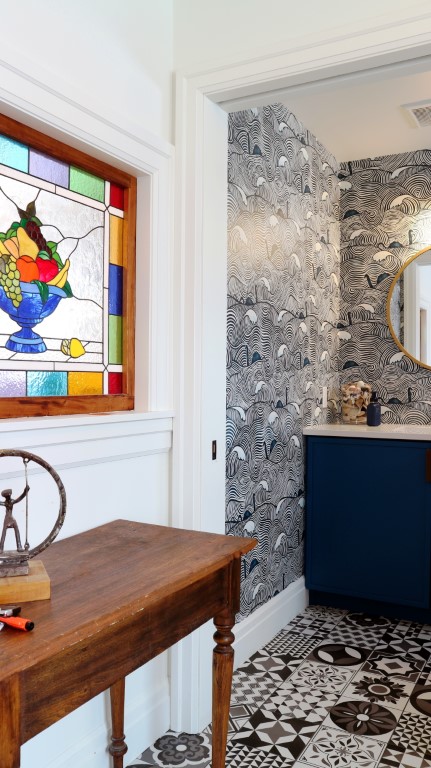
If you’re looking for more wow-factor, wallpapers make a colourful statement but can be expensive and I have concerns about the toxicity of cheaper ones. Instead, hang a colourful blanket or quilt on the wall or create a French salon wall – showcasing a grand collection of photos, prints and memorabilia.
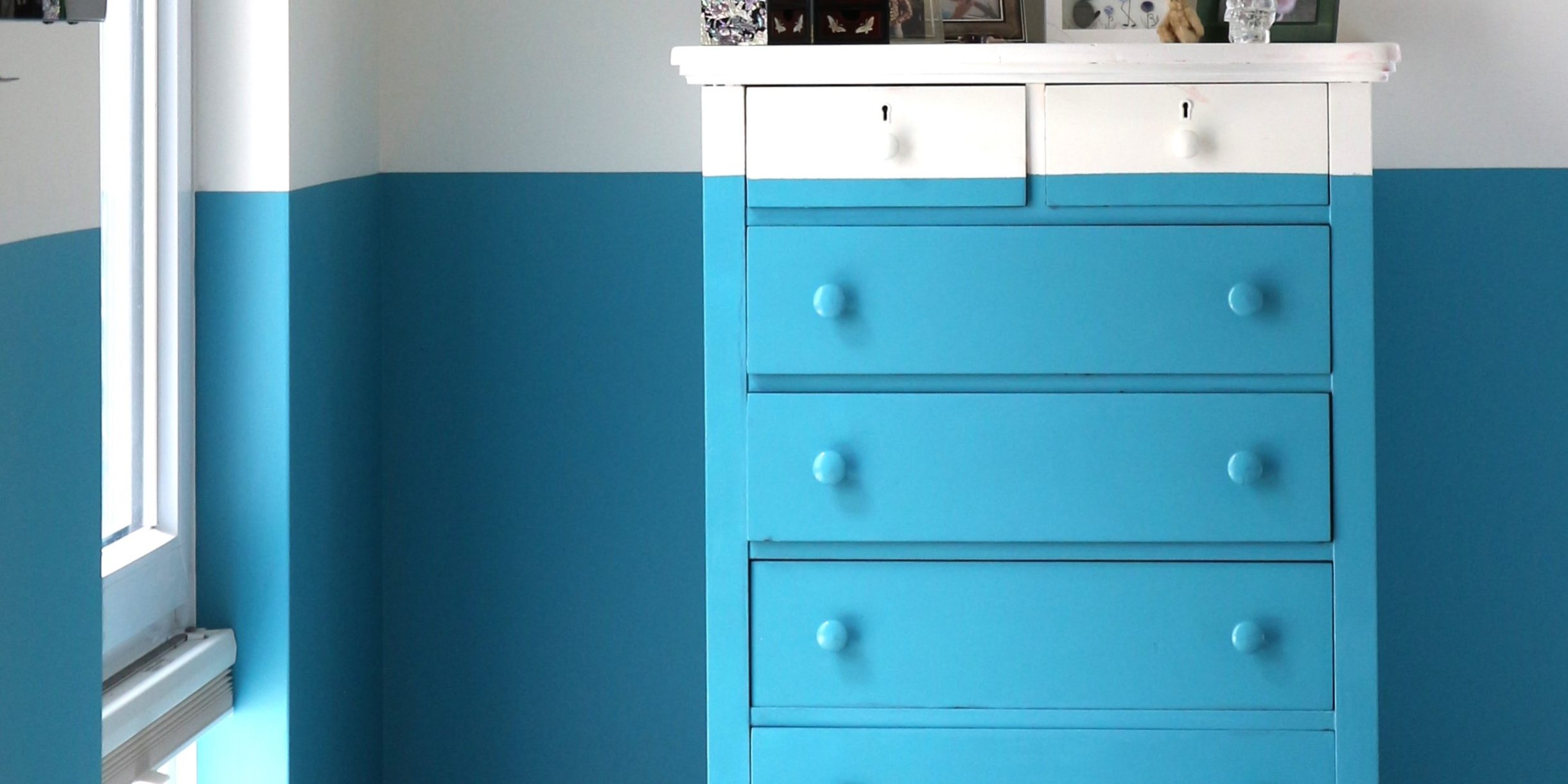
Painting is fairly affordable, especially if you DIY it. Be sure to use zero VOC paints. Farrow&Ball is my go-to mineral paint. Have fun with it – colour drench a whole room in one bold colour (that’s walls, ceiling, trim and doors). Or paint a fantastic burgundy on a ceiling. Paint 1/3 of the way up all the way around an entire room, including right over a console or a bed headboard. Colour blocking is a delightful way to add colour while remedying a room’s flaws – make a narrow room appear wider or provide a focal point where none exists.
And finally, support local artisans and Canadian makers. Investing in handcrafted pieces not only brings colour into your home but also adds a story and a sense of connection to your space.
Jennifer: Anything else you’d like to add on the topic?
People shy away from using bright colours in their home for one reason — fear. Fear of being seen as childish, fear of making a mistake, or fear of getting bored with a bold choice. But here’s the thing—when we go with the safe, unsaturated colour, we hardly notice it after a week. Go for the colour that excites you! It’ll look outrageous for a day or two and then you’ll settle into it and it’ll put a smile on your face every time you walk by.
Here’s Jennifer’s full feature from The Telegram:








Thank you Heather. Please do share a photo of your painted room!
What a well written article. I love your suggestions about colour…. You’ve inspired me to paint a room in my house!